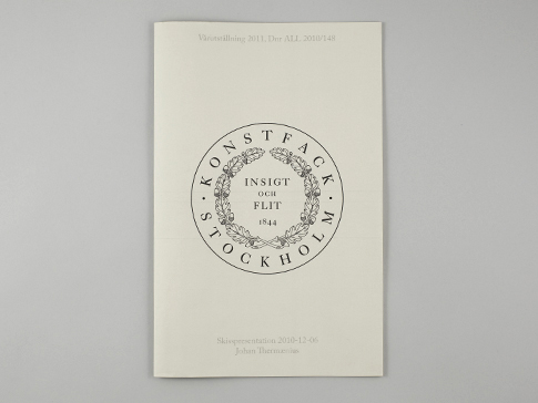
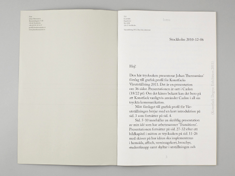
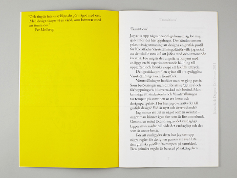
Design proposal for the 2011 edition of the annual Degree Exhibition at Konstfack University College of Arts, Crafts and Design, Stockholm, an exhibition with 180 students from all disciplines.
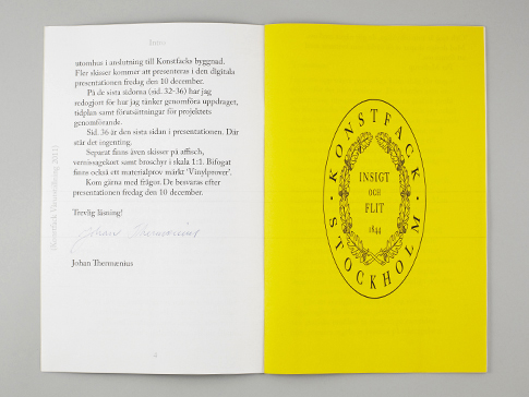
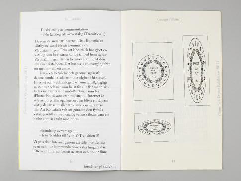
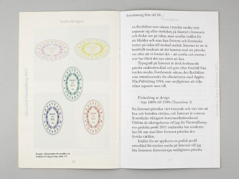
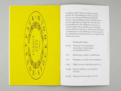
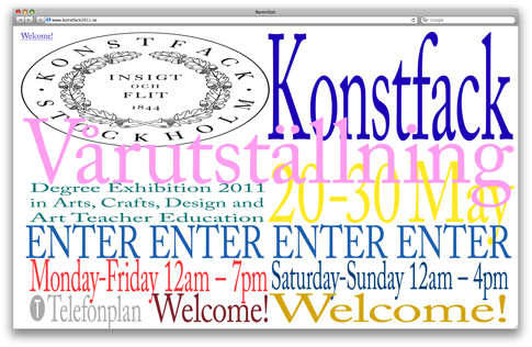
The brief asked for a design that would strengthen the school as "innovative" and "bold". The idea is to highlight the structure of the school as well as making something "new" for the new graduation students and new degree exhibition. "New" I defined as something familiar with a slight twist. Therefor I chose to use Konstfacks already established typeface Caslon aswell as their old seal as main elements. Also every BA and MA class was given one colour each.
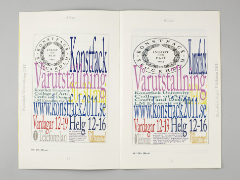
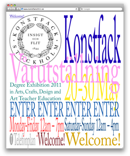
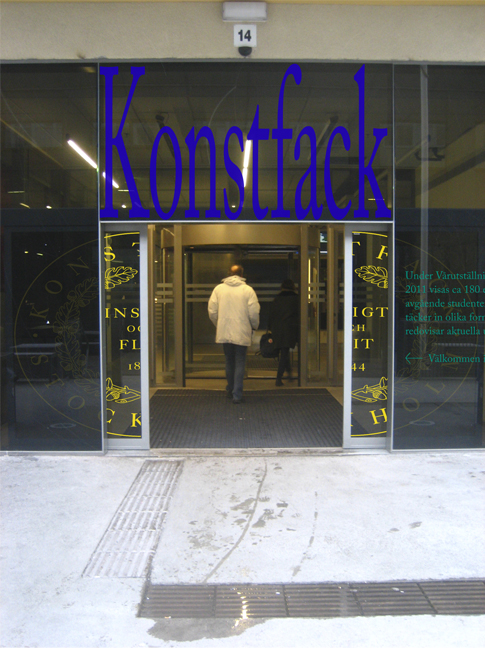
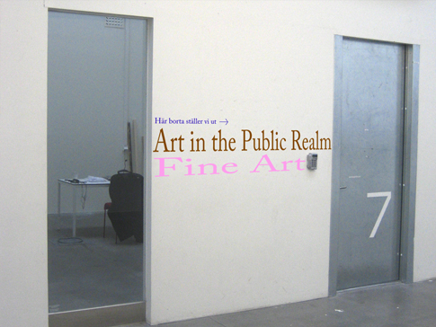
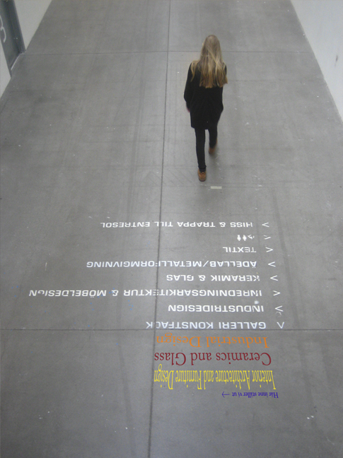
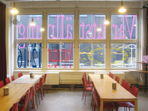
Since Konstfack no longer makes printed catalogues but only web catalogues I decided to let the Internet set the rules for the rest of the design. The slight twist of the familiar starting point was to let the content of the web catalogue be scaled by enlarging or reducing the browser window. Instead of having texts that flow the content would be fixed. This results in strange looking type, either very condensed or very extended – a unique look based on the already existing design. This expression of the type was then moved from the virtual to the real world, letting the boundaries of the school building decide the size and look of the signage. Thanks to Joel Galvez for helping out with the web programming.
( read less )


